SoFar Sounds Poster Design: 08.25
I designed this poster for a SoFar Sounds music show taking place in Venice Beach, CA. I was inspired by some designs I had pinned earlier this year that had overlapping type. I've been using georgia typeface extensively for work so I decided to see how it could render in this type of arrangement. In the examples I saw, the letters were different sizes and overlapped in different ways. I usually design in a more organized fashion so I tried to lineup my main headline "SoFar Sounds Los Angeles" into a long rectangle. Next I overlapped lowercase georgia over the all caps georgia and adjusted as necessary to create the more rectangular shape. Once I was satisfied with the font lockup, I started exploring backgrounds.
I keep a Pinterest board called "harmonious hues" to keep a log of interesting color combos I'm drawn to. This helps when I'm designing to have some ideas to grab from. I decided to insert a tribal pattern in the background that reminds me of Venice Beach, CA, where the concert will be held. After trying some different color combos and textures this pink, orange and purple gradient was my favorite.
Bands featured:
Doe Paoro
Satnam
My Brothers and I

In my normal day to day, I create ideas and designs for ecommerce companies, which means strict rules and guidelines for what the output should be. When I get around to creating poster designs for SoFar Sounds, I treat them like an abstract piece of art.
I had the opportunity recently to collaborate with SoFar Sounds and Amnesty International to create a poster design for their "Give a home" initiative in support of the world's refugees. 1,000 artists, 300 gigs, 60 countries, 1 day.
I've been doing Sofar Sounds posters for over a year now. I was very excited when this new project came up, to design a poster for Cold War Kids playing at Union Station, Los Angeles.
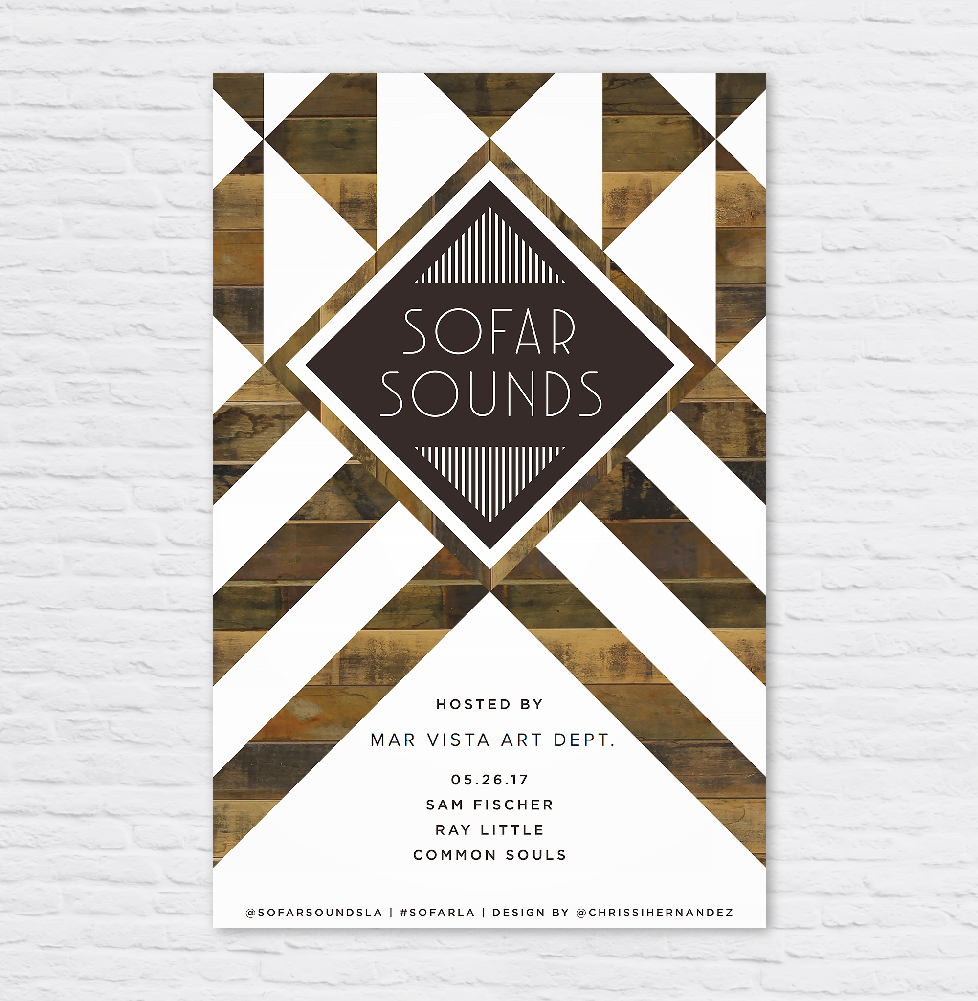
So Far Sounds L.A. had a show at MV Art Dept in my blossoming neighborhood of Mar Vista. I wanted to mimic the beautifully designed sign as you enter the store. Gorgeous geometric patterns of reclaimed wood, white paint, and steel. I am personally a big fan of MV Art Dept bringing murals and creative workshops to the neighborhood.
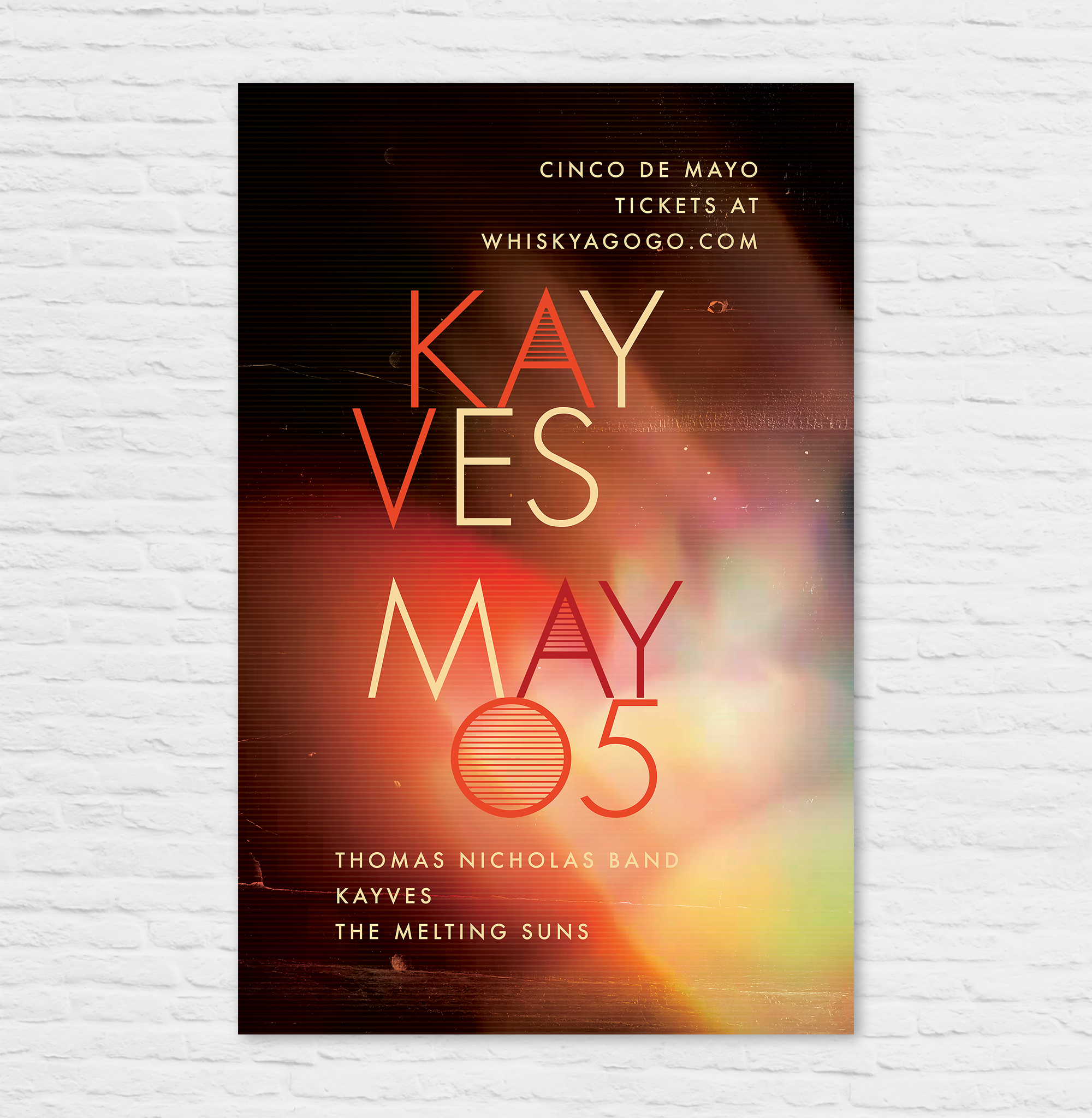
Kayves musical influences include Joy Division, Foals, Interpol, The Cure, and Tame Impala. The band is working on an EP to keep the momentum going after a promising start at Coachella.
Poster design for SoFar Sounds show in Culver City. Inspired by desert colors, and blended with random geometric shapes. Enjoy!
I designed this poster for a SoFar Sounds music show taking place in Santa Monica, CA. When I started the design, I wanted to do a play on the letters in SoFar Sounds to create the abbreviation "SAMO" within, short for Santa Monica.
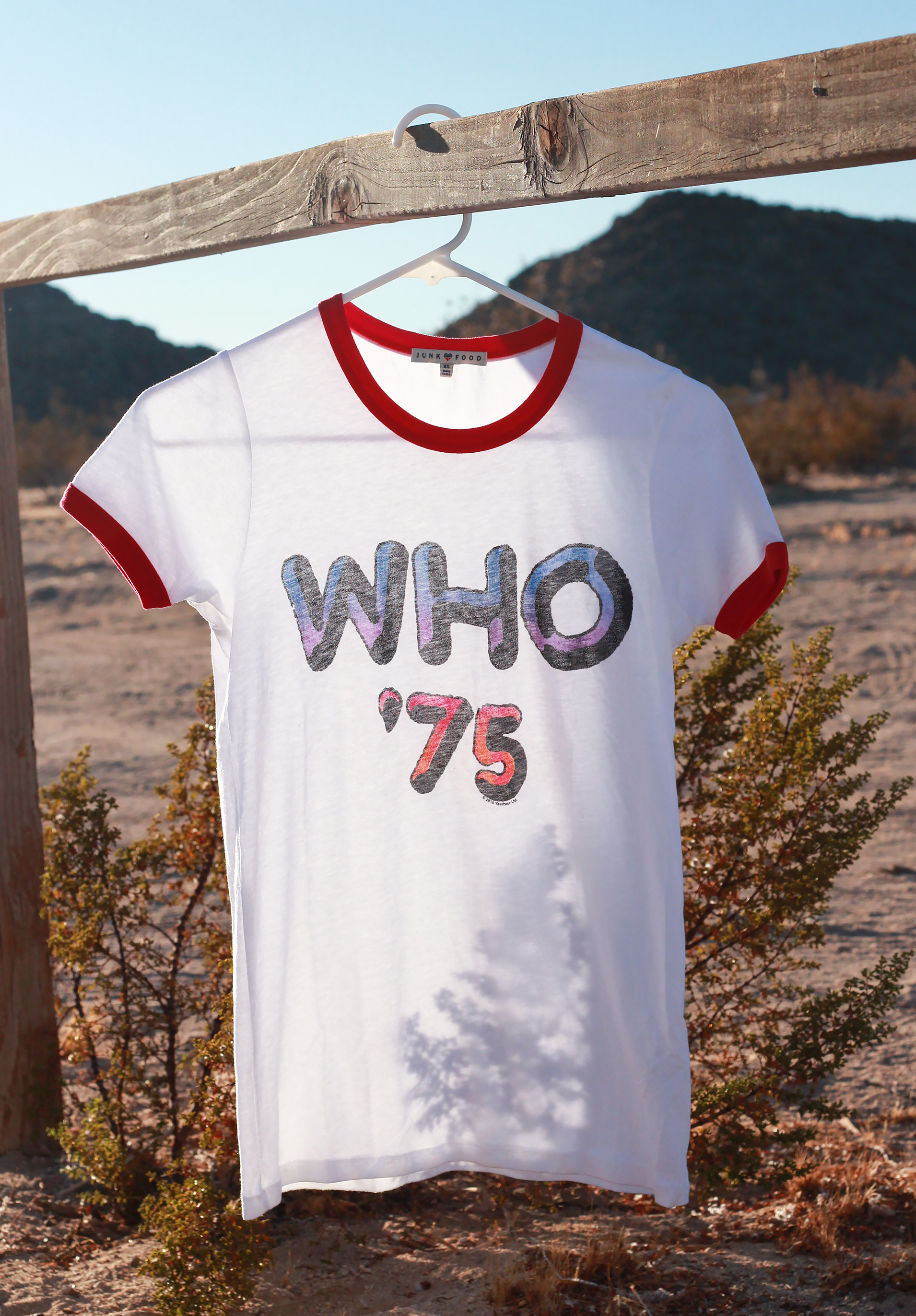
Desert trip, nicknamed "Oldchella," is coming up soon! I've searched the web for these cool throw back tees with bands playing the epic festival this October in Indio, CA like this The Who 70s throwback tee from Junk Food Clothing. Represent your favorite legends!
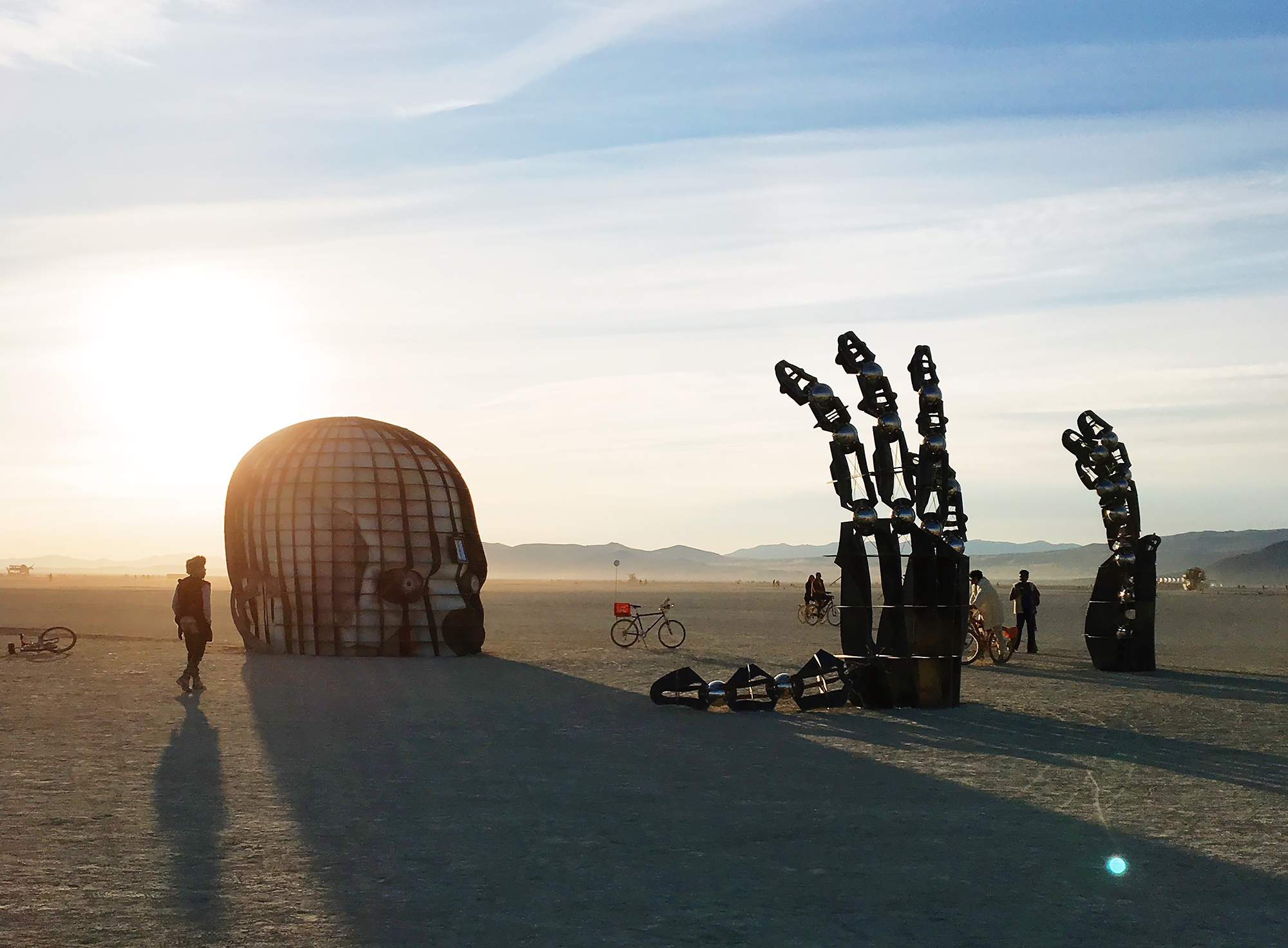
If I could describe Burning Man in one word it'd be "surreal." In fact, the whole festival feels a bit like stepping into a Dali painting. I admit, I was skeptical even through my first day and half of being there. Now I'm convinced it's one of those experiences that you'll covet forever.


