SoFar Sounds Poster Design: 03.02
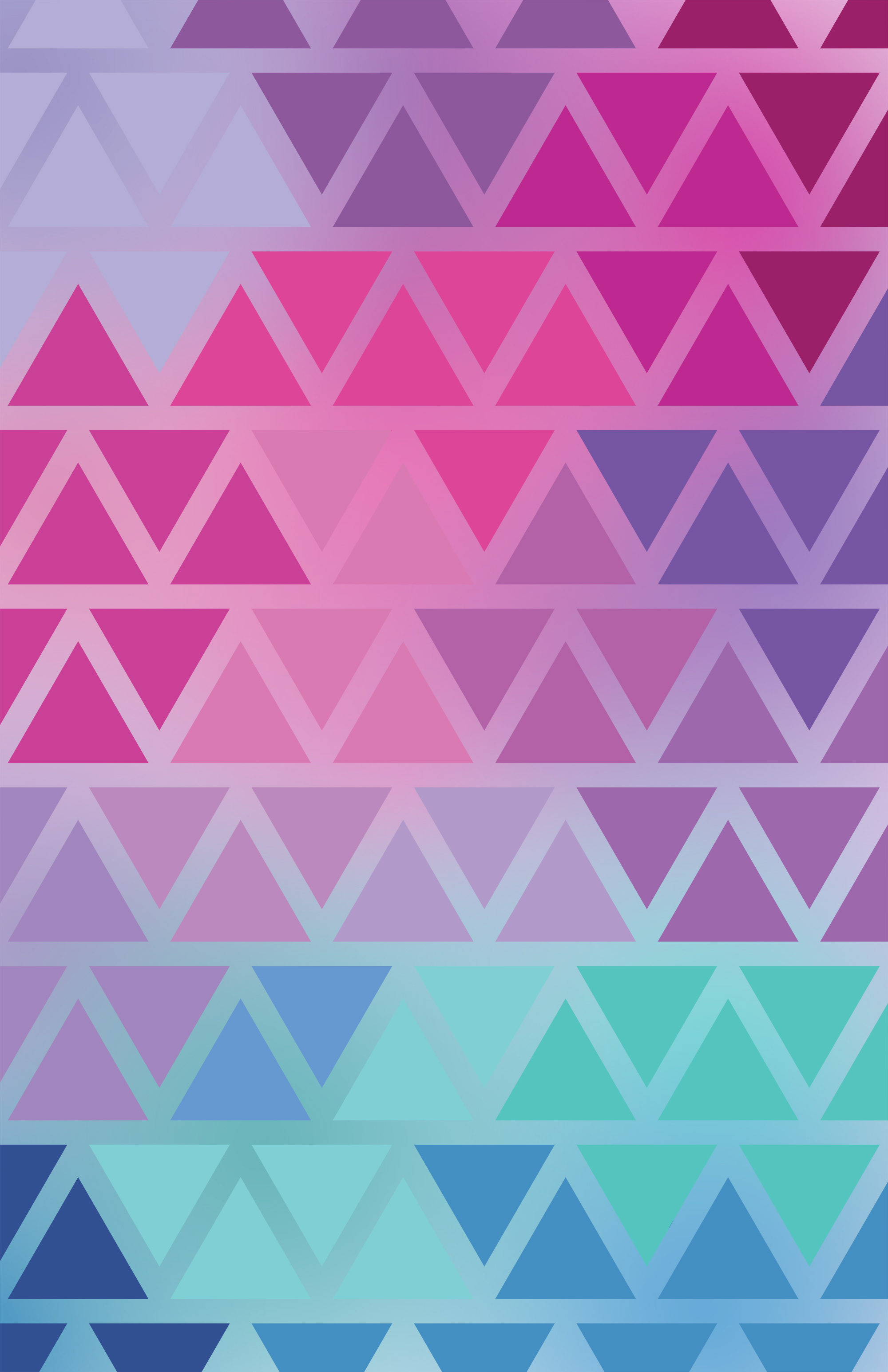
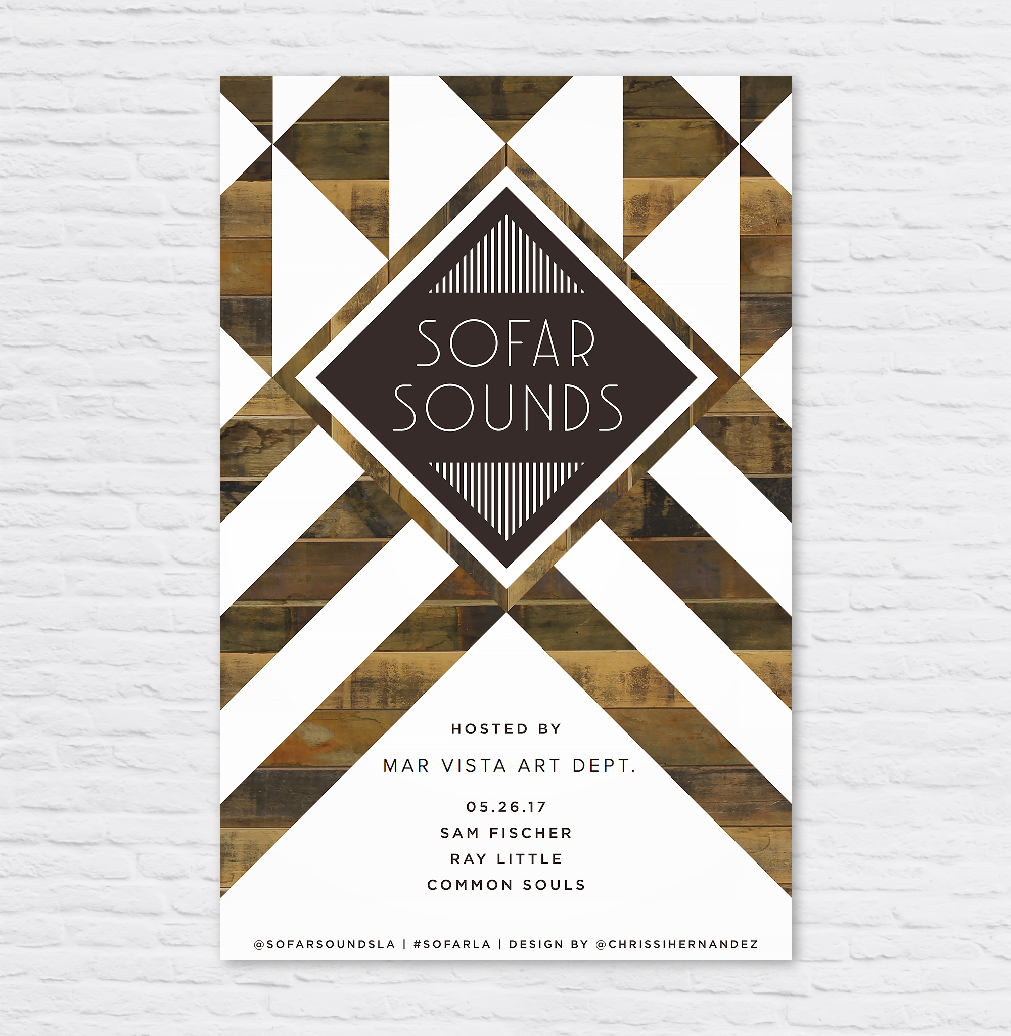
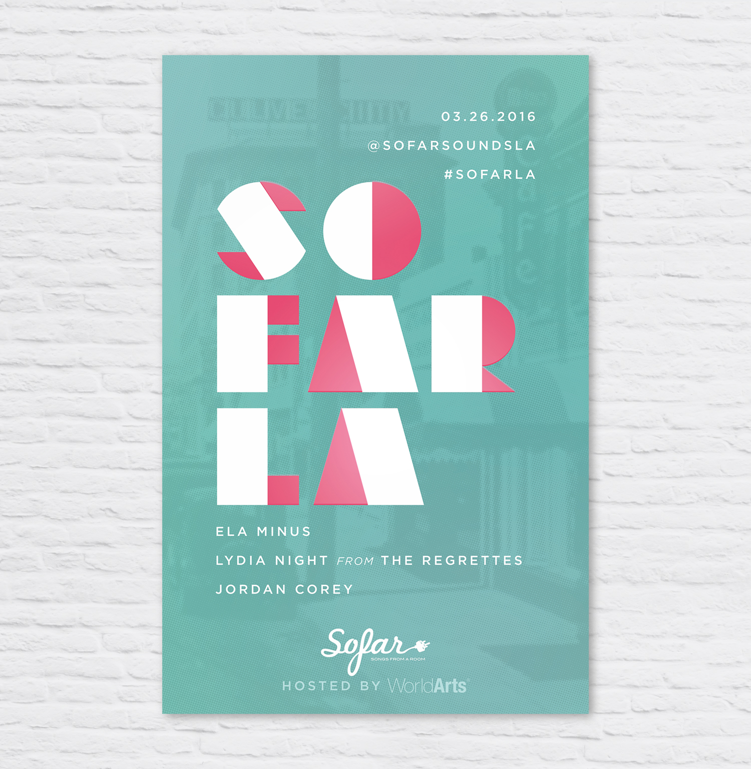
In my normal day to day, I create ideas and designs for ecommerce companies, which means strict rules and guidelines for what the output should be. When I get around to creating poster designs for SoFar Sounds, I treat them like an abstract piece of art. I start designing with typography and patterns until it sparks an idea or I stumble across it. For this design, I began with the idea of a triangle patterned backdrop, but I wanted to color in the triangles in an abstract pattern of colors. I filled in the colors by selecting certain triangles and coloring them in as a clipping mask (with those familiar with Adobe Photoshop). At the end of the exercise, I unclipped it to make sure all the triangles were filled in, and saw this interesting abstract design had formed. I ended up liking this design more than the original idea, so I went with it, and even tried a few options filling in the shapes with patterns and you can see below. For the text, I was inspired by a poster design I saw on Pinterest, so I tried to create the type myself and then based on that some new letters to fill in the gaps. I finished it off with one of my favorite san serif typefaces, Gotham, to add in the band, date and venue information.


