SoFar Sounds Poster Design: 06.26
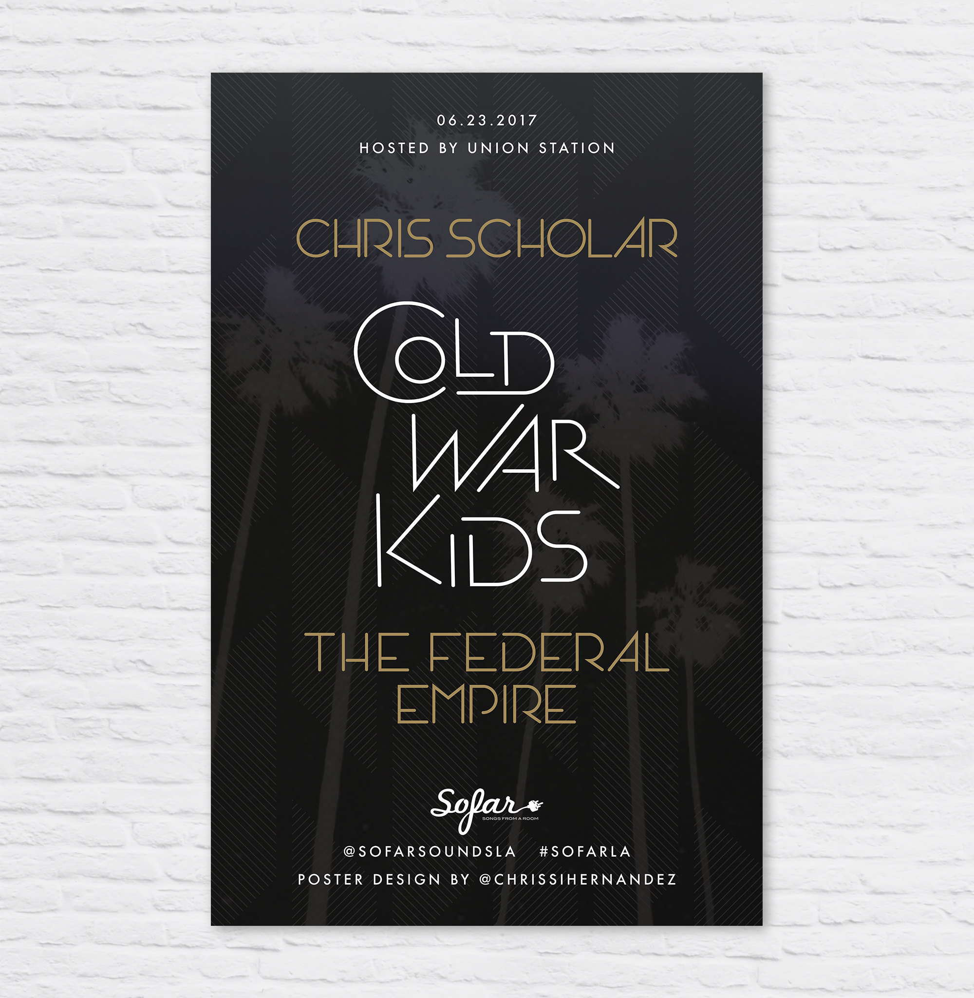
I've been doing Sofar Sounds posters for over a year now. I was very excited when this new project came up, to design a poster for Cold War Kids playing at Union Station, Los Angeles. The show was days away when I was asked to design it, so I went to work. I had an idea in my head for the text, so I drew it quickly onto a piece of paper to photograph on my iPhone and port into Adobe Illustrator.


I brought my chicken scratch into Illustrator to try and create a similar layout. Do do this created an original font. Sometimes it takes less time creating one rather than trying to find one that will work. I used a lot of circles and lines manipulated to create the characters. The "S" is always the hardest.
Below is the first layout I came up with, and the one like the most. Feedback came back that since this is a sofar sounds show, we gotta give some L-O-V-E to the other bands so I modified the poster to scale up their band names. This made it tricky, especially since I didn't have a lot of time on my hands.

I reorganized the hierarchy and centered the type for this end result in 2 color ways. Which is your favorite?