
SoFar Sounds Poster Design: 11.17
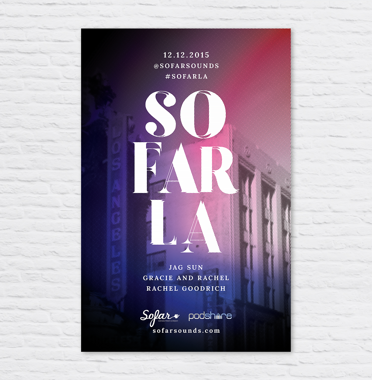
I designed this poster for a SoFar Sounds show taking place in Studio City. I found a Studio City image and manipulated it with a color halftone and a purple and blue gradient overlay. I used an Art Deco inspired font and played with the arrangement to add interest. I'm going to try and stick with the same overall theme of location and an overlay of color for at least the next three posters to create a Los Angeles SoFar series of five. Stay tuned, the next is coming in December!
Featured
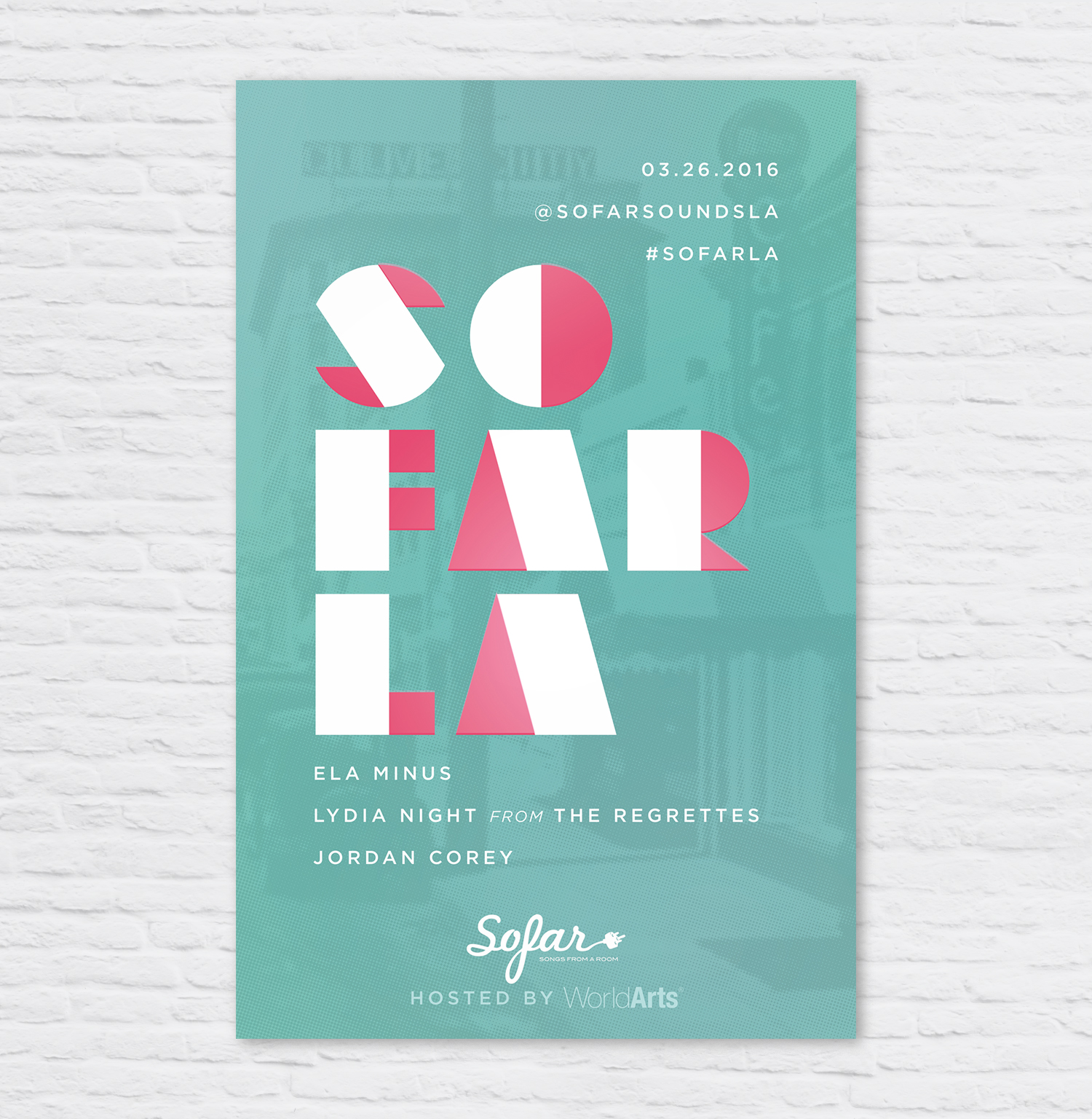

I designed this poster for a SoFar Sounds music show taking place in Santa Monica, CA. When I started the design, I wanted to do a play on the letters in SoFar Sounds to create the abbreviation "SAMO" within, short for Santa Monica.