

SoFar Sounds Poster Design: 09.27
I designed this poster for a SoFar Sounds music show taking place in Santa Monica, CA. When I started the design, I wanted to do a play on the letters in SoFar Sounds to create the abbreviation "SAMO" within, short for Santa Monica.
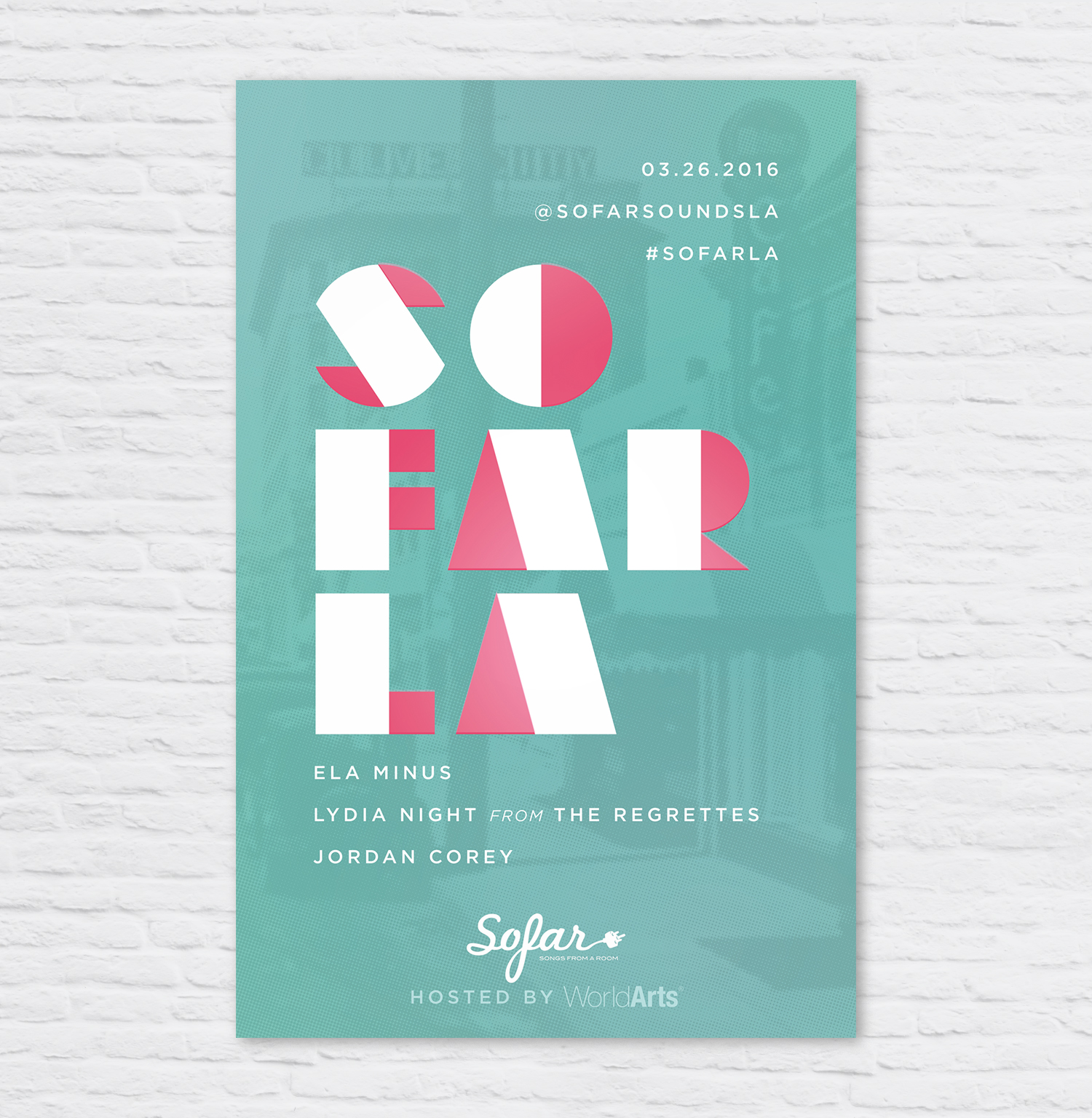
SoFar Sounds Poster Design: 03.26
I designed this poster for a SoFar Sounds show taking place in Culver City. I used a vintage image of Culver City, added a color halftone effect and overlaid it onto a seafoam green color.

SoFar Sounds Poster Design: 01.28
I designed this poster for SoFar Sounds L.A.'s January 28 show. I found this great trendy typeface called Hill House Medium. I love the double bars of the and dots below the O's.
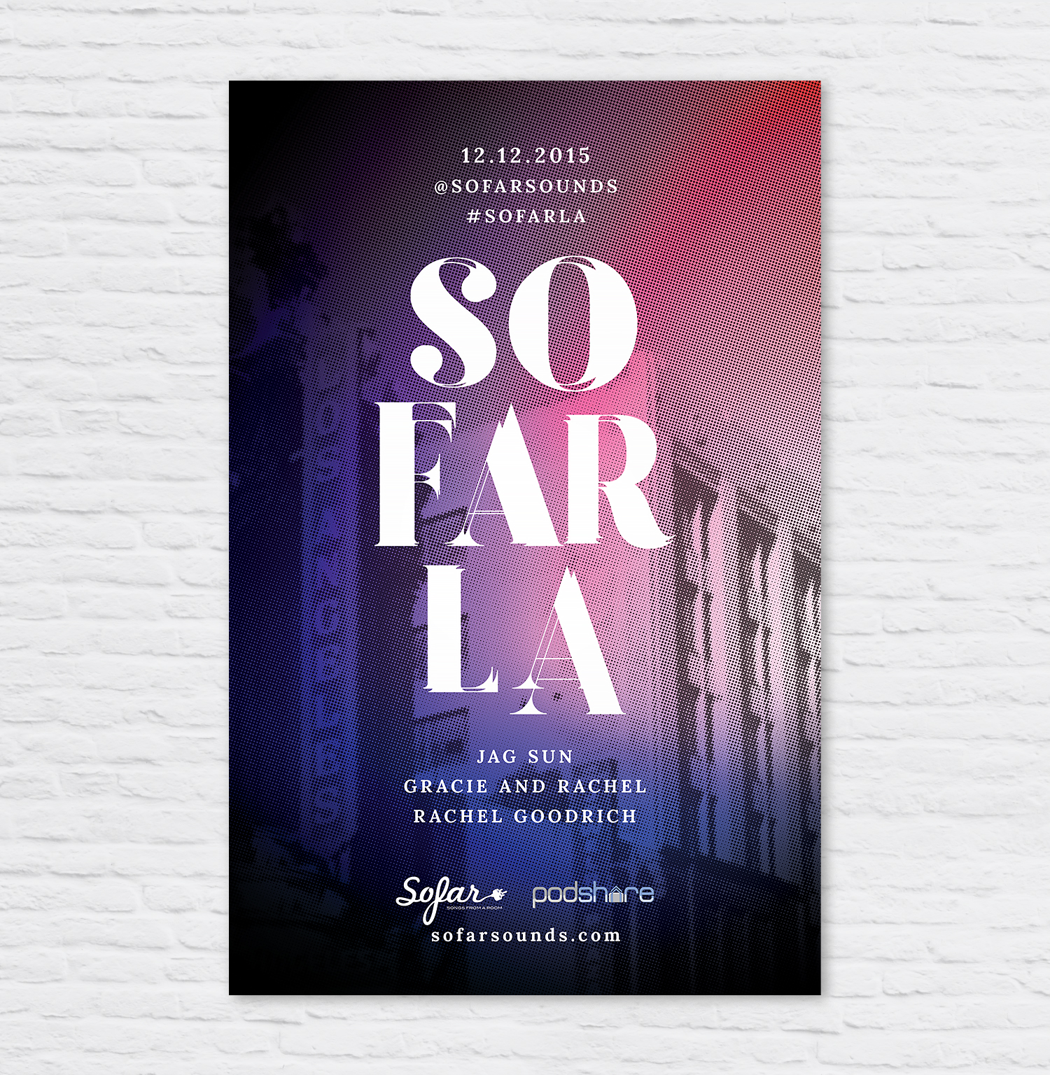
SoFar Sounds Poster Design: 12.12
Here is tonight's poster design for SoFar Sounds Los Angeles. I took this photo while downtown on a shoot this past Tuesday. Fonts used are Lora Bold and Goku Regular.