
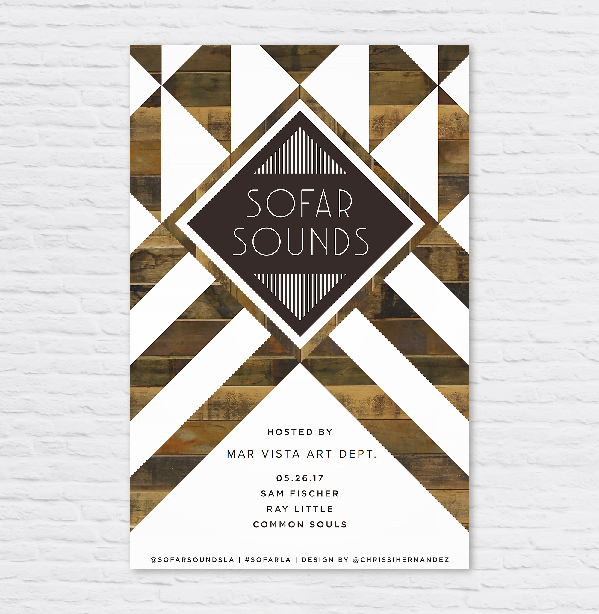
SoFar Sounds Poster Design: 05.26
So Far Sounds L.A. had a show at MV Art Dept in my blossoming neighborhood of Mar Vista. I wanted to mimic the beautifully designed sign as you enter the store. Gorgeous geometric patterns of reclaimed wood, white paint, and steel. I am personally a big fan of MV Art Dept bringing murals and creative workshops to the neighborhood.

SoFar Sounds Poster Design: 09.27
I designed this poster for a SoFar Sounds music show taking place in Santa Monica, CA. When I started the design, I wanted to do a play on the letters in SoFar Sounds to create the abbreviation "SAMO" within, short for Santa Monica.

SoFar Sounds Poster Design: 08.25
I keep a Pinterest board called "harmonious hues" to keep a log of interesting color combos I'm drawn to. This helps when I'm designing to have some ideas to grab from.

SoFar Sounds Poster Design: 02.27
I designed this poster for a SoFar Sounds show taking place in Culver City. I used an image of a sunset that I took and overlaid it onto a red and purple gradient to give it a moody effect. I used the typeface DecoNeue Light and tweaked in in Illustrator to give it some more character.

SoFar Sounds Poster Design: 01.28
I designed this poster for SoFar Sounds L.A.'s January 28 show. I found this great trendy typeface called Hill House Medium. I love the double bars of the and dots below the O's.